
The Anatomy of a Digital Frame: How Mats, Borders, and Shadow Effects Transform Artwork

The frame around a famous painting is often not the one the artist chose. That tells you how much the frame matters

Walk through almost any museum and you'll see paintings in gold, black, wood and white frames, some carved and some barely there. It's easy to assume each frame came with its painting. Often it didn't. The Brooklyn Museum notes that most frames in its collection are not original; collectors replaced them over the centuries to suit their own taste, and today curators, conservators and framers choose new ones together.
A frame, then, is an interpretation. It tells you where the artwork ends and the room begins, which details to notice first, and what kind of object you're looking at: a treasure, a document, a window, a design. Change the frame and you change the conversation.
That's as true on a screen as on a wall. Digital art frames, virtual mats and simulated shadows are borrowing a vocabulary framers have refined for centuries. Knowing a few basic art framing techniques is the fastest way to make any digital art display look intentional rather than accidental.
The traditional art of framing
Why so many old frames are gold
Gilded frames weren't only about luxury, though they signalled that too. According to the Brooklyn Museum, gilding and silvering also reflected light, helping to illuminate dim interiors and the paintings themselves before electric lighting. A carved gold moulding caught candlelight and threw it back onto the picture.
Rare survivors show how closely early frames could be tied to their paintings. Brooklyn's Virgin and Child with Four Angels and the Redeemer by Zanobi Strozzi still sits in its original frame from about 1450, which the museum calls “a rare exception.”
The nineteenth century: frames for the market, frames for rebels
By the 1800s, mass production had made frames more affordable, with ornament cast from moulds in an eclectic mix of historical styles, as the J. Paul Getty Museum explains. The official Paris Salon was full of heavy gold frames, some of them 17th-century antiques reused on new paintings.
Then artists started pushing back. Edgar Degas sketched his own frame designs and often chose white frames. At the first Impressionist exhibition, the Getty notes, white frames set the new paintings apart from the conservative, gold-framed works of the Salon. The frame had become a statement. Vincent van Gogh felt the same way. He preferred plain wooden frames, sometimes painted, and disliked gilding. As he put it in a letter to his sister Wil:
“If the painting looks good in a simple frame, why put gilding around it?” Vincent van Gogh, quoted in The Art Newspaper
The modern turn: frames that step back
Piet Mondrian went further. The Philadelphia Museum of Art describes how he rejected traditional picture frames because they created an illusion of depth. He mounted canvases on stepped constructions of thin wooden strips so that the painted surface projects slightly forward into the room. His framing is the clearest evidence that borders and shadows are never neutral: Mondrian removed them precisely because of what they do to a painting.
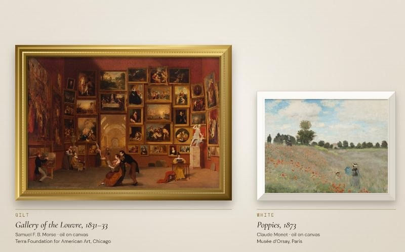
Understanding the anatomy of a frame
Every framed artwork is a small stack of layers. Each one does a job, and each one has a digital equivalent.
The frame (moulding)
The moulding is the visible outer border. Its profile (flat, rounded, stepped, carved) and finish (gold, black, natural wood, white) set the tone before you register the image. A wide carved moulding announces importance. A thin flat one stays out of the way.
The mat
A mat is the card border between artwork and frame, cut with a window for the image. For works on paper it's more than decorative. The Northeast Document Conservation Center calls the window mat “the standard mount for works on paper”: it protects the piece and keeps the glazing from touching its surface. Conservators recommend 100% cotton rag mat board.
Visually, a mat creates negative space: a quiet zone that separates the artwork from the busy wall around it and draws the eye inward.
Borders and negative space
“Border” is the broader term for any band between the image and the outer edge: a mat, a painted margin, a fillet (a thin inner strip), or simply the unpainted edge of paper. Van Gogh sometimes painted his own. In Still Life with Coffee Pot he added a red border and a wider white one directly on the canvas, according to The Art Newspaper.
Glazing
Glazing is the glass or acrylic in front of the work. Standard glass and acrylic don't block ultraviolet light, so NEDCC recommends glazing that filters at least 99 percent of UV for anything that matters. Glazing also adds reflections, which is one reason museums light framed works so carefully.
Shadows and perceived depth
Look closely at a framed picture and you'll see small shadows: under the lip of the frame, along the bevelled edge of a mat, inside a deep shadowbox. Your eyes read these cast shadows as depth, so the artwork seems to sit inside the wall rather than on it. That sense of depth is what makes a framed print look like an object. It's also what Mondrian worked to eliminate.

How framing changes artwork
The same principles play out very differently depending on the work. Three combinations show the range.
A classical oil painting in a gilded frame
Picture a 17th-century Dutch portrait in a carved gilt frame. The warm gold picks up the amber tones of aged varnish and the candlelit skin, and the ornament matches the formality of the sitter. The frame announces the painting as precious, much as its first owners intended. Put the same portrait in a thin black frame and it can suddenly look like a reproduction: the frame no longer supports the painting's era or its warmth.
A watercolor with a generous white mat
Watercolors are built on the white of the paper; the lightest passages are often just paper showing through. A wide white or warm-white mat continues that luminosity outward and gives a delicate work room to breathe. It's the natural home for something like a Winslow Homer sea study, where transparent washes would be overwhelmed by a heavy frame. Many framers also make the bottom margin slightly wider than the top so the image doesn't appear to sink.
An abstract painting with a minimal border
Mondrian is the textbook case. A thin strip, set back so the canvas floats forward, keeps attention on the flat planes of colour and lets the painting behave like part of the architecture. Wrap the same composition in an ornate gold frame and the grid starts to look like a window into a pictorial space, the illusion he spent his career taking apart.
What each choice does, at a glance
Mat width: wider mats isolate the work and make small pieces feel more important. Narrow mats feel tighter and more casual.
Border contrast: a white mat brightens and lifts colours. A dark mat deepens them and makes highlights glow. High contrast sharpens the edge of the image; low contrast softens it.
Frame colour: gold warms and formalises; black reads graphic and modern; natural wood softens; white disappears into a pale wall.
Shadow strength: a soft, short shadow adds believable depth. A long, dark one starts to look like a sticker floating off the wall.
The digital evolution of framing
A screen has no moulding, mat board or glass. Virtual picture frames are pixels, and that changes the rules in useful ways.
Virtual frames and digital mats
On a display, the frame and mat are drawn around the image. That means they can change per artwork: gold for a Rembrandt, white mat for a watercolour, nothing at all for a contemporary photograph. No one has to rehang anything.
Mats that solve the shape problem
Most TVs are 16:9 landscape rectangles. Most paintings aren't. A tall portrait shown full-height on a TV leaves empty bands on either side. A digital mat turns that leftover space into a deliberate border, so the painting looks matted instead of letterboxed.
Simulated shadows
Software can imitate the small shadow a real frame casts on its mat. Done subtly, it gives a flat screen a hint of physical depth. Overdone, it looks artificial, so less is usually more.
Edge-to-edge display
Then there's the opposite choice: no virtual frame at all. The TV's own bezel becomes the frame, and the artwork fills the screen. It works best for images that were made for screens or that tolerate cropping, such as photography, digital art and some abstraction.
Digital art displays today
There are three broad ways to bring framed art onto a screen. Each makes different trade-offs.
Dedicated digital frames
These are standalone devices built for display. Aura's Carver Mat, for instance, surrounds a 10.1-inch screen with a mat-style border in a classic frame, aimed at family photos shared through Aura's app; TechRadar's review praised the app while noting its landscape-only orientation and glossy screen. Muse Frame takes an art-first approach, advertising access to more than 6,000 artworks plus monthly curated exhibitions. Dedicated frames are always on and designed to look like objects, but you're buying, placing and powering a separate device.
Art TVs
Some televisions are designed to double as art displays. Samsung's The Frame has an Art Mode, a glare-reducing display, and an Art Store of more than 5,000 artworks (a subscription is needed for the full selection), plus optional bezels in different finishes. Its Art Mode includes selectable matte styles and colours. It's a strong solution if you're buying a new TV anyway.
Software on the TV you already own
The third route is an app that adds frames, mats and a curated library to an existing smart TV. There's no extra hardware, and the art appears at the size of your TV. The trade-off is the screen itself: a standard glossy TV can reflect more light than a matte art display, so placement and room lighting matter more. For a deeper look at this choice, see our guide Art TV vs. Smart TV: Which Is the Smarter Buy?
Dedicated frame | Art TV | App on existing TV | |
New hardware | Yes | Yes (a TV) | No |
Typical size | Tabletop to wall-sized | TV sizes | Whatever TV you own |
Screen finish | Varies by model | Often glare-reducing | Usually standard TV glass |
Frames and mats | Physical, digital, or both | Digital mats, optional bezels | Digital, set in the app |
Meet Liquid Canvas
Liquid Canvas takes the third route. It's a streaming app that turns a compatible smart TV into a TV art display, with curated collections that range from iconic works to emerging artists. It's available on Roku, LG, Samsung, Google TV, Apple TV and Amazon Fire TV; compatibility varies by model.
Framing is built in. Art Mode lets you present work with virtual frames and mats: subtle borders, museum-style mats, or clean edge-to-edge display. Frame finishes include black, wood, white, silver and gold, and in Picture Frame Mode you can apply frames and mats to a single image or an entire playlist. That makes it easy to try the ideas in this article: gold around a Dutch portrait, a white mat around a watercolour, nothing around a photograph.
Because it runs on the TV you already have, there's no dedicated art TV or separate frame to buy, and a 7-day free trial lets you test frame styles in your own room before deciding.

Conclusion: the frame is part of the experience
For centuries, frames have told us how to look: gold for treasures in candlelit rooms, white for Impressionists breaking with the Salon, almost nothing for Mondrian's flat planes. Digital art frames carry that tradition forward with one big advantage: you can change your mind. Try a wide mat on a small sketch, gold on a portrait, edge-to-edge on a photograph, and notice how differently each one feels in your room.


Comments